We are experts in Responsive Design & Development, increase your sales and website conversions with a responsive website
Anyone with a Smartphone or Tablet knows that browsing sites designed for Laptops and Desktop computers can be less than an ideal solution. Responsive Design is built to make the experience of browsing a website an enjoyable experience regardless of the device you choose to view the site from.
Learn more about Responsive Websites
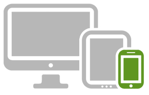
Compatible on all mobile and tablet devices
Responsive web design allows your website to be compatible with all the latest mobile and tablet devices. By making use of fluid design and crafting your site to respond optimally to the size of the screen it is viewed on, it will look perfect whatever the environment – be it an iPhone or large desktop monitor.
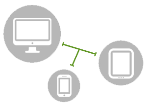
Beautiful website regardless the screen size
At Distinctive UK we take a ‘mobile first’ design approach, allowing us to determine the key essentials before bringing in the exciting content when the screen size allows. This design process lets us work from smartphones to tablets to desktop monitors, meaning no matter what size or resolution the screen displays your site, you can be 100% confident it will look stunning.
Save time and money with one website
Responsive design will save you time and money over the short, medium and long term. One site means a multitude of deployment possibilities!
Going responsive guarantees lower initial set-up costs compared to developing concurrent mobile and desktop versions of the same site. It also means you only have one site’s content to maintain, thus lowering the risk of incorrect/inconsistent content across the company’s web presence.
Want to launch a responsive website or convert your existing website?
Call 01823 284 066 or
Contact Us